


CSS stands for Cascading style sheet, and it was awesome, ever since it came out in the year 1996 when Netscape was the top browser, and then the idea of a responsive layout comes in the year 2007 when Apple launches its iPhone.
CSS is not hard to learn, but it's evolved comprehensively during the last 25 years. So today, we are going to learn about how to write some clean CSS using some of the modern features.
Let's get started,
Flexbox is Fantastic:
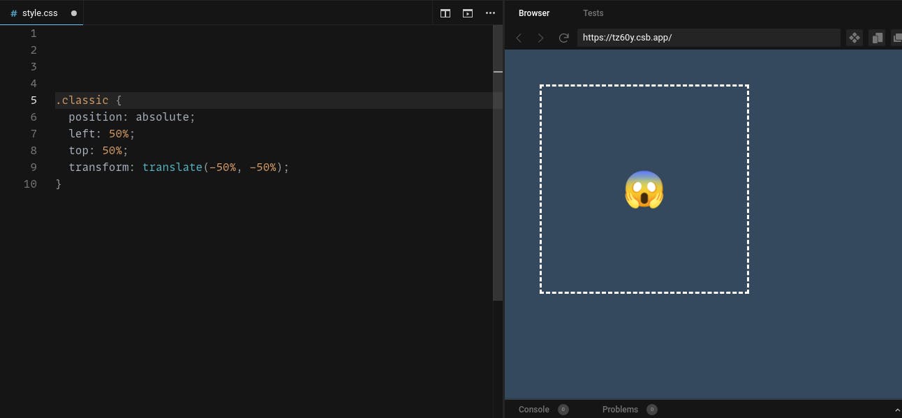
In the early days, positioning of the element relative to each has one of the challenging aspects of CSS. If you want to position a div both horizontally and vertically,
One option is to give the child position absolute, then move it to the bottom right corner by using the top and left properties then, translate it back to 50% to put it in the center. That can work but, it's hard to graspable.
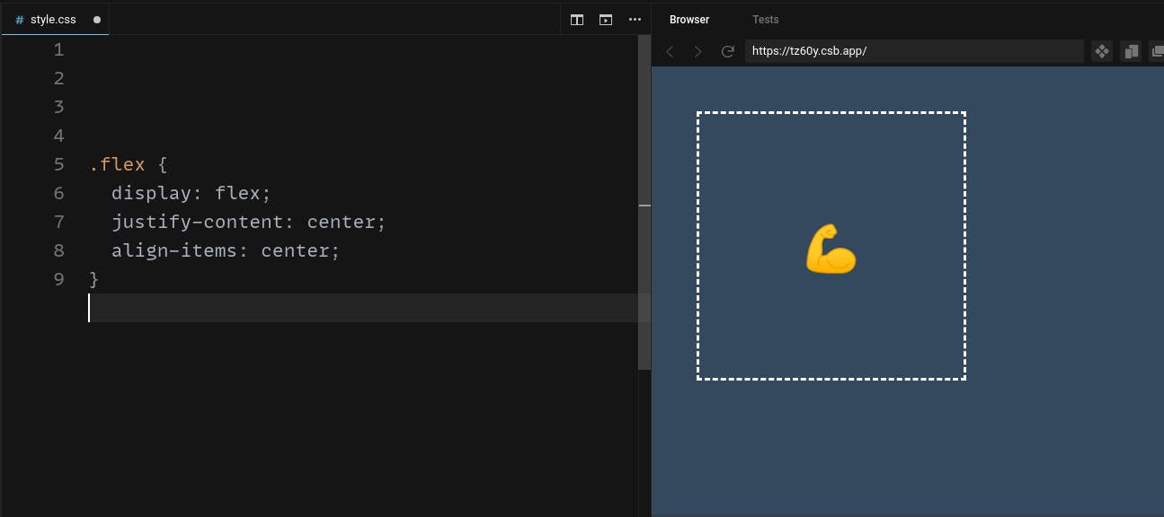
A much better approach in the modern CSS is flexbox, which allows you to create a flexible column or row anywhere in the UI. When an element has a display flex, it also has an x and y-axis on which you can align its children.
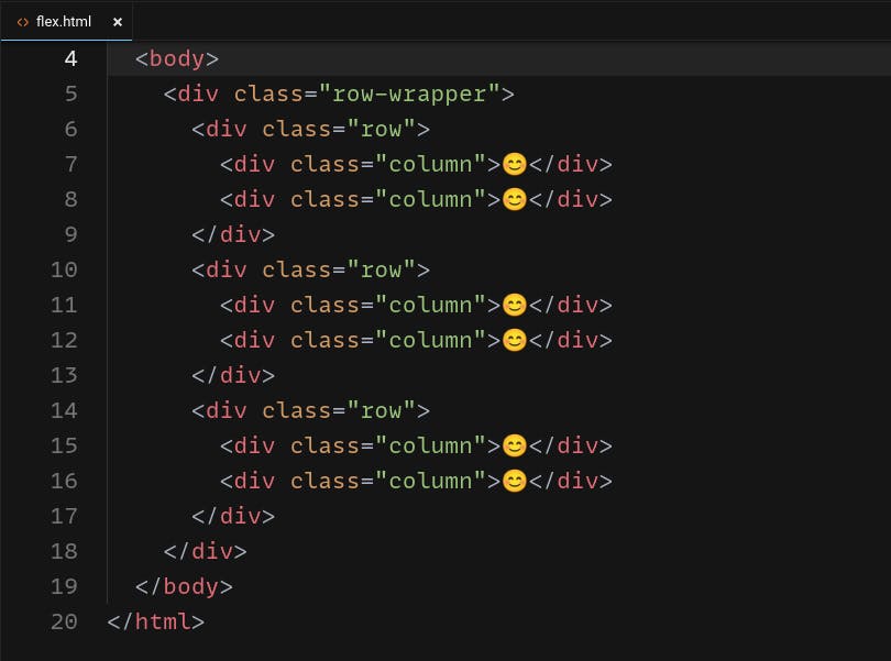
But it does have one major drawback if you have a big complex with many intersecting rows and columns, we may end up with a lot of confusion.
Grid is great:
Luckily, there is a modern CSS feature called a grid that can reduce much of your code. Unlike, flexbox which only deals with individual columns and rows, the grid allows you to work on multiple columns and rows.
When you set an element to display a grid, you can define its children as a bunch of columns and rows.
The columns have a width that can be defined with the grid template columns property.
We have three values here separated by spaces which means our grid has three columns notice the fr value (Fractional unit) which will responsibly share the available space with other columns in the grid.
We can also define some rows and now every element inside the grid will be positioned automatically.
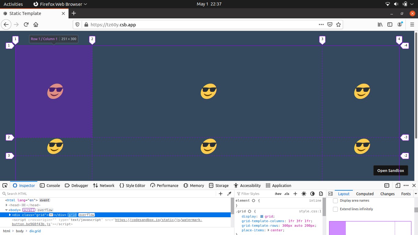
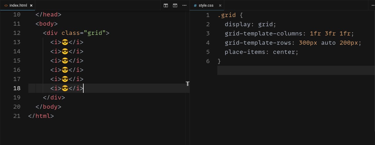
But the important thing to be noticed is, the amount of HTML and CSS we eliminated when compared to the flexbox layout or the table layout.
A clamp function:
If we want to include responsive layouts to our website, we are using media query CSS by changing the width of something based on the available space on the device or viewport.
For example, you might have an article that has a preferred width of 50%, but on small screens, you want to make it fixed at 200px or fixed it 800px on large screens. You can do that by writing some media queries that can apply responsiveness based on the viewport size.
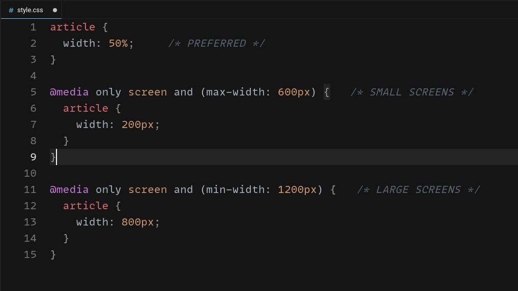
The only problem with this is hard to maintain a lot of media queries when the project grows larger. But the good news is though we can have some CSS functions min, max, and clamp.
We could refactor this code to set the width of a clamped value that has a minimum of 200px, a maximum of 600px then a preferred value of 50%.
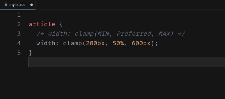
It will turn 30 lines of code into one so a lot of code reduction 😎️
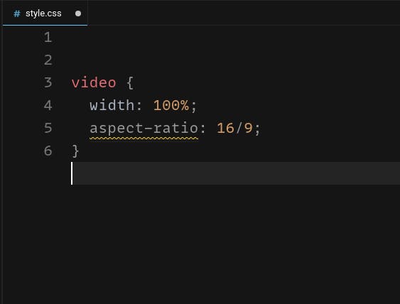
Aspect Ratio:
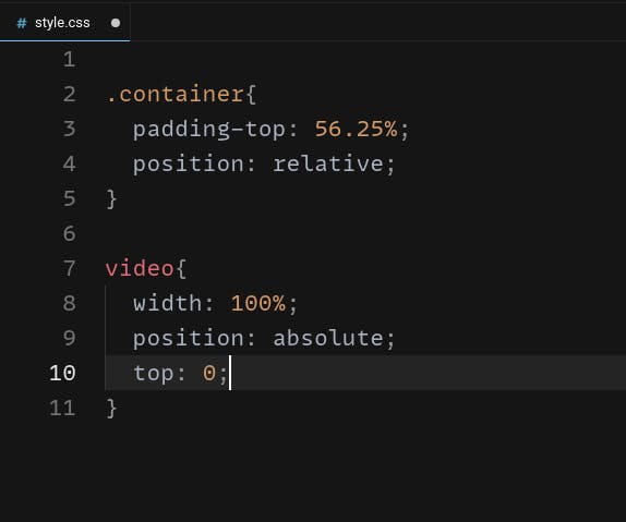
If you ever had to code a responsive image or video that maintains a particular aspects ratio.
For example, If you want to embed a video with a 16x9 aspect ratio that requires some hack where you put 56.25% padding on the top then, give its child position absolute property.
Alternatively, we can use the aspect ratio property from the modern CSS. So, we are eliminating a lot of CSS code by adding one line instead of many.
Using Variables:
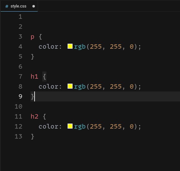
The most important part of writing clean CSS code is to make it more flexible so that refactoring should be very easy. A great way to achieve that is with CSS custom properties or variables.
For example, In the given piece of code, notice how we are using the same color value in multiple places; If we decide to change the color, we need to modify every line of code that references it.
A better approach is to define a global variable on the root selector, which can be referenced wherever it's needed, and now when you decide to change it, you have to modify one line of code.
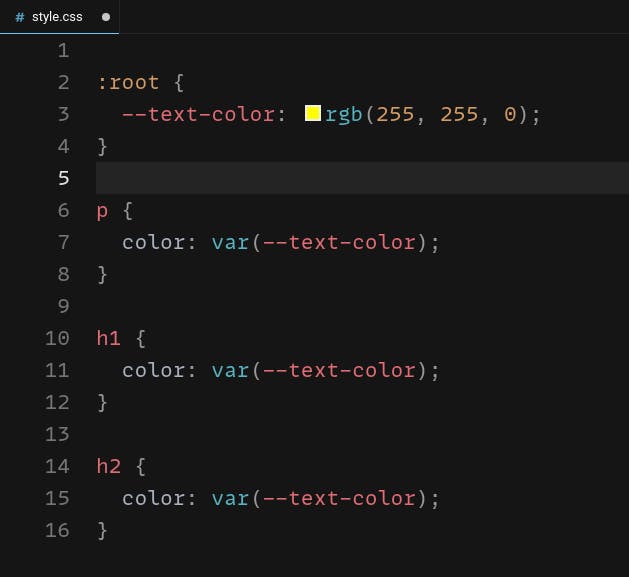
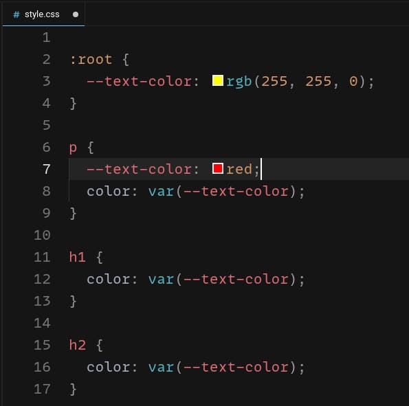
Variables cascade everything else in CSS, which means you can overwrite them by redefining them somewhere inside the property.
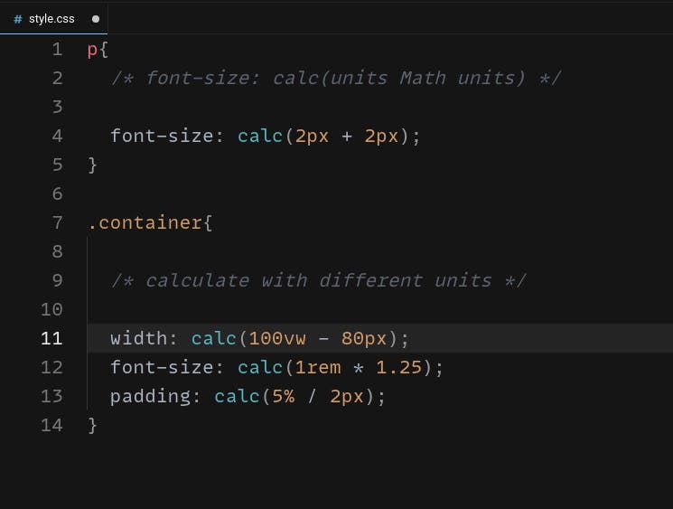
Calculations using calc function:
CSS is not a programming language, but it does have the ability to run basic calculations using the calc function. It allows you to calculate a value with basic math, but the cool thing about it is you can combine different units.
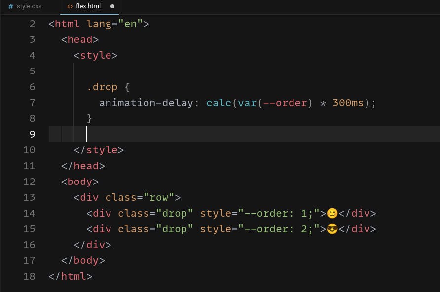
We can also define an inline CSS variable for every element and can be accessed inside the CSS property.
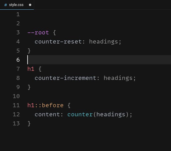
State Management counter:
Did you know that CSS has a state management mechanism build into it that you can keep track of a running count in your CSS code without ever writing a single line of javascript code? 🤔️
For example, If you want to number headings in your Html, the regular way to do this is by manually adding numbers in the Html, but if you want to add a new heading you have to renumber everything manually.
A smarter approach would be a CSS counter, you can create a counter in a code using the counter-reset property, then increment it by counter-increment property. It will starts from 0 then add 1 to every h1 element in the DOM.
There are a lot of CSS tips, but I covered some of the most important ones. So which one is your favorite CSS tips 🤗️, and if you know any other CSS pro tips that you have used in day-to-day coding, please put them in the comments 👏️.
If you like the content, please share this article with your friends.
Thanks for reading!
Happy coding.